Fans and Players Criticise United States’ FIFA World Cup 2022 Jersey
Football fever is about to take over the world this fall, and everyone eagerly awaits. Qatar is the host for the very first time, and the preparations are going at full throttle. All the qualified nations are releasing their home and away kits for the tournament, and companies like Nike, Adidas, and Puma are all displaying the results of their creativity for the nations they sponsor.
The United States World Cup Jersey Criticize As Bland
The jerseys released by Adidas have been loved by everyone because of how distinct and beautiful they are. Puma and Nike, on the other hand, have had mixed opinions about their releases, with some liking them and others thinking they are too bland. One such criticized release is the USMNT team home and away kit released by Nike.
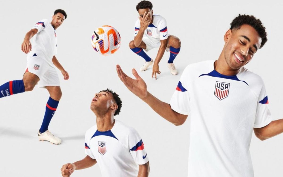
The home kit for the US is a complete white jersey with the USMNT logo in the middle and blue-red strips on the sleeves. The color pattern is identical to the nation’s jersey for the 2002 World cup.
Nike and the US football federation have faced immense criticism for this jersey by the fans and players.
The general opinion about the jersey is that it’s too simple and looks like another football jersey. The fans expected to make a statement of identity with their jersey being released, similar to that made by nations like Germany, Argentina, and Mexico.
The way these nations instill their unique sense of identity into their jerseys makes everyone who lays eyes on their jersey know that they are looking at the jersey of a particular nation from a particular edition of the World Cup. These things leave an impression on fans worldwide, making that particular jersey almost immortal because of how distinctly recognizable it was, even among many other wonderful world cup kits.
Nike Puts No Effort While Designing Jersey
The home kit of a nation usually is a reflection of its core cultural or global identification factors.
It carries out a similar function to that country’s flag regarding recognization. They usually follow the colors of the national flag and the sports brands try to showcase those colors in the most unique yet simple way possible.
But making it too simple cancels out the unique aspect of it, and that’s what happened to the jersey of the United States Men’s National Team. They made it too simple, which compelled everyone to think that there was no effort put in while designing that jersey.
Now when it comes to the away jersey, the designers have little more room to experiment and give more importance to the “being unique” aspect of designing the kit. They can take inspiration from anything, any person, or any event from any period of the nation’s history and convert those ideas of inspiration into designs and display them on a jersey.
They can also do anything random but unique with the away jersey, which isn’t much related to the nation. However, it will still be connected to that nation’s identity because the emblem of the nation will be on that kit no matter what.
Fans and Players Disappointed About Jersey
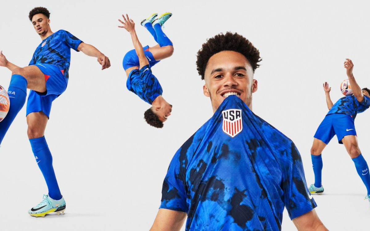
The away kit displayed by the USMNT follows a somewhat tie-dye blue pattern all over the jersey.
This is 2022, and a tie-dye pattern is the farthest thing from something unique in 2022. It has become a commonly used pattern by uncountable apparel brands worldwide, and it no longer stands out like it used to when it first came into the spotlight.
So even when it comes to the away jersey, it is fair to say that the disappointment among fans was pretty understandable. The response from people, including the fans, reflected the disappointment. “Tried to tell them,” were the comments of Weston McKennie where he meant that he tried to point out to the higher up what would be the reaction of everyone when they see this jersey.
Another American midfielder Yunus Musah said that he thought the jersey was very average and that he rated in the middle, which was neither good nor bad. He pointed his thumb towards the side during a press conference to denote what he said about the jersey being in the middle.
It may look like it, but the huge dislike of the jersey is not much related to the design. It is more about what people want for their self-identity. People want to be known and remembered in such global events, and jerseys are the main mark of identification, and if they are not much unique they give the people of the country a sense of being nobody.